Rebranding Audubon Naturalists Society for a more inclusive future
Nature Forward
After listening to the voices of its diverse community, the Audubon Naturalist Society decided to change its name to build on the strengths of its past and move forward toward a stronger, more inclusive future. The 126-year-old conservation organization asked Spitfire to help lead the renaming and branding process to ensure the new name and brand identity reflected their values and unique work in the Capital Region.
First, Spitfire helped the organization prepare a public announcement about the decision to change its name. This included drafting compelling messaging about why the organization decided to change its name and what it signaled for the future. The announcement garnered stories in FOX DC, NPR, DCist, the Washington Post, Bethesda Beat, The Guardian, and The Washingtonian.
We then embarked on a robust and stakeholder-driven process to identify what the new name and brand identity had to accomplish to be successful. We conducted a broad survey and hosted focus groups and one-on-one stakeholder calls to gather insights from a diverse group of stakeholders. Overall, we engaged over 1,000 community members in the process, gathering insights about the values and themes that the new name needed to convey as well as asking participants to vote and provide feedback on various name options.
We heard from the community that the new name needed to honor the history of the organization, while signaling a greener, more inclusive future for all nature lovers. Informed by these insights, we led monthly workshops with key stakeholders, including the Naming the Future Taskforce, board members and staff, to identify a new name, tagline, logo and brand identity that reflects the next stage of the organization's evolution.
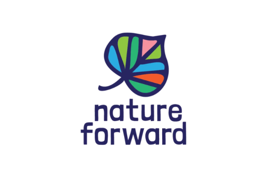
After a robust and dynamic process, the organization announced its new name: Nature Forward. The name represents the optimism we heard about the impact the organization can have, as stewards of the region's outdoors, if residents of the Capital Region move forward together. The new logo features the beautiful redbud leaf, a native plant to the region. The redbud's heart-shaped leaf represents the organization's love for the community and nature, while its characteristic pointed tip represents an arrow – progress towards a greener future for the next generation. The new name was shared in an exclusive with the Washingtonian.